Designed an intuitive, engaging, and educational tool that makes small-scale gardening accessible to everyone.
introduction.
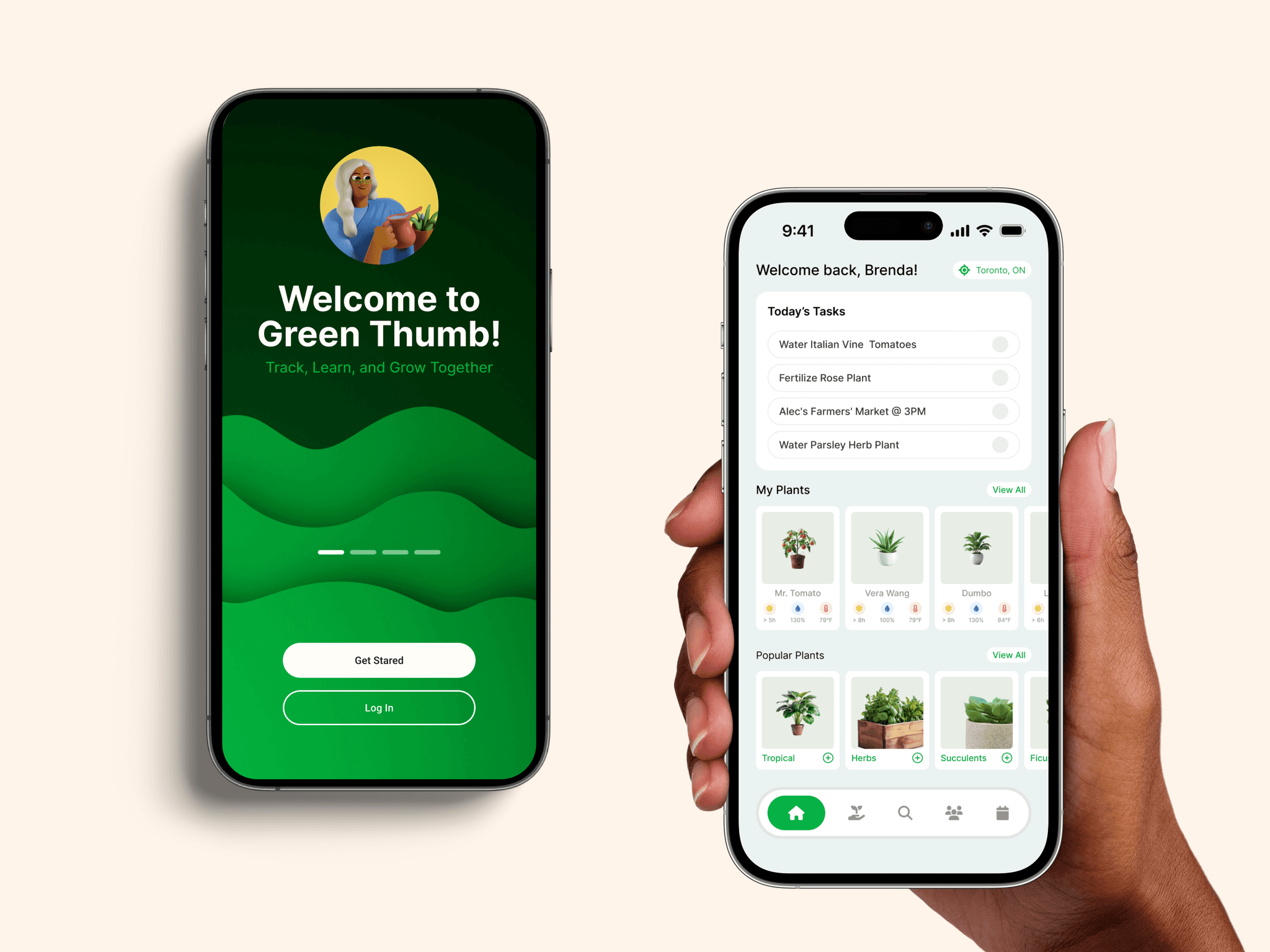
The ultimate app for beginner gardeners! Our easy-to-follow guides and personalized care tips empower you to successfully grow plants on a small scale, whether you’re cultivating fresh herbs for your kitchen or creating a beautiful indoor oasis.
*This was a 3 month project for a User Experience Design course at the University of Toronto, ending in a competitive presentation to IBM executives.
team.
Kevin Hu
Munaema Khurram
Alec Sampalaneau
Viktor Zhuang
motivation.
motivation.
motivation.
research.
To gain a proper understanding of our problem space and potential users, we created online surveys, conducted in-person semi-structured interviews, and performed an observational study at an Urban Agriculture club at the University of Toronto.

insights.
A large number of people are interested in urban agriculture because:
environmental sustainability.
financial motivation.
sense of community.
People do not engage in Urban Agriculture because:
lack of awareness.
lack of time.
lack of space.
Our target was... everyone (who could use a phone)! We found that sampled individuals of multiple age ranges were interested in engaging in urban agriculture.
This design challenge required creating a solution that appealed to multiple age groups, balancing functionality, style, and aesthetics.
With tight weekly deadlines, we prioritized beginner users over urban farmers, as the latter were harder to access and study within the time constraints.

Beginner Brenda.
Brenda, 19, is a first year university student living in Downtown Toronto. Given the recent surge of climate change awareness, she's been wanting to become more involved in environmentally conscious activities such as reducing her carbon footprint by growing her own vegetables. Given she's a student, she would also appreciate saving money where possible. However, she shares a condo downtown, doesn't know much about gardening, and has little time between school and work.
scenerios.
Scenario creation helped describe and imagine the different sorts of tasks that the design should be able to allow users to accomplish.
Although our persona may look similar to the scenarios that we have used, our persona 'Beginner Brenda' was used to empathize with our users, whereas the scenarios below were used to simply visualize actual tasks that users would need to be able to perform using the design.

scenerio one.
Tim is passionate about cooking and experimenting with different cuisines, often hosting dinner parties to showcase his skills. He values a healthy lifestyle and wishes he could grow some of the ingredients he uses. However, living in an apartment makes him doubt if farming is feasible. Past attempts at keeping houseplants failed due to a lack of knowledge about watering, sunlight, and fertilization, and he’s unsure where to find farming tools.
scenerio two.
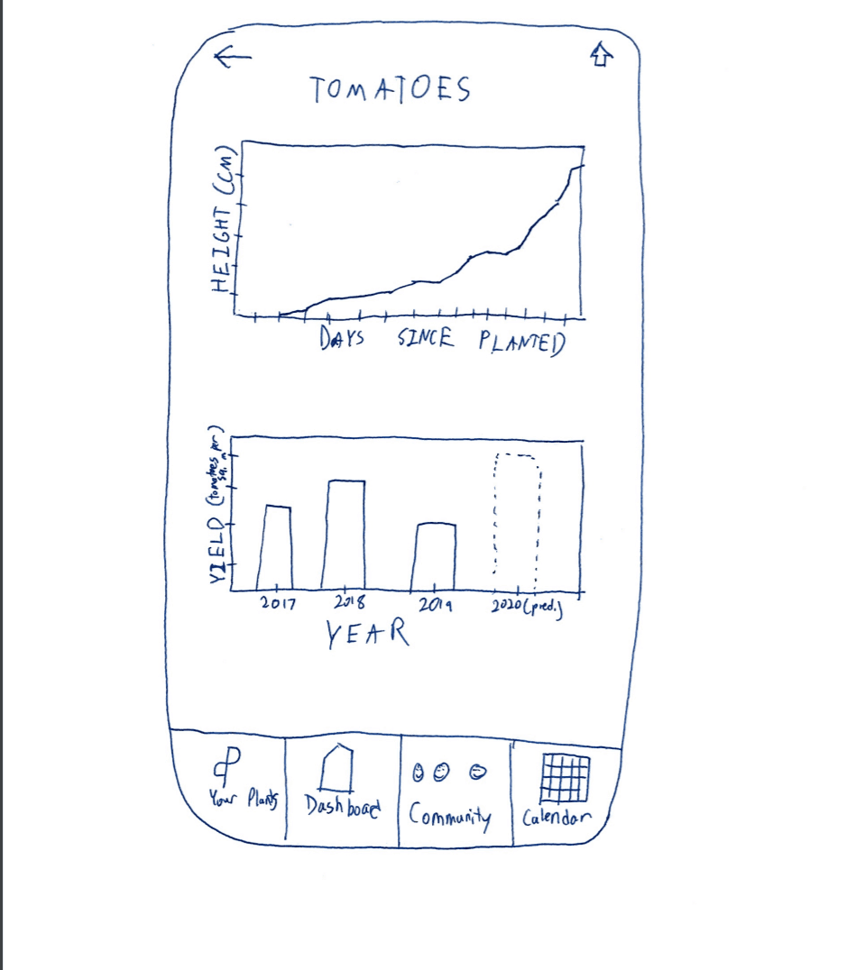
Yousef has been growing houseplants for a few months but struggles to track their progress. Measuring plant height is tricky without help from his roommates, and he avoids measuring leaves or petals to prevent damage—or injury from thorns. Any measurements he does take often go unrecorded, making it hard to monitor growth over time.

design.
We created a list of basic design requirements that we wished to follow throughout the project.
useful.
Our system needs to provide resources and education on urban farming to the users. Users need to feel satisfied from the guidance and support they received from our system.
useful.
Our system needs to provide resources and education on urban farming to the users. Users need to feel satisfied from the guidance and support they received from our system.
trustworthy.
The design should foster trust, enabling users to rely on it to meet their needs through intuitive and thoughtful design.
functional & beautiful.
The priority in the design must be functionality, and a consequence of a well functioning design is beauty.
simple.
Accessibility is key, offering an easy way for users of any skill level to engage in urban sustainability with minimal cognitive effort.
positive reinforcement.
Use the psychological principle of positive reinforcement to improve and encourage a good learning experience.
task analysis.
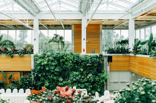
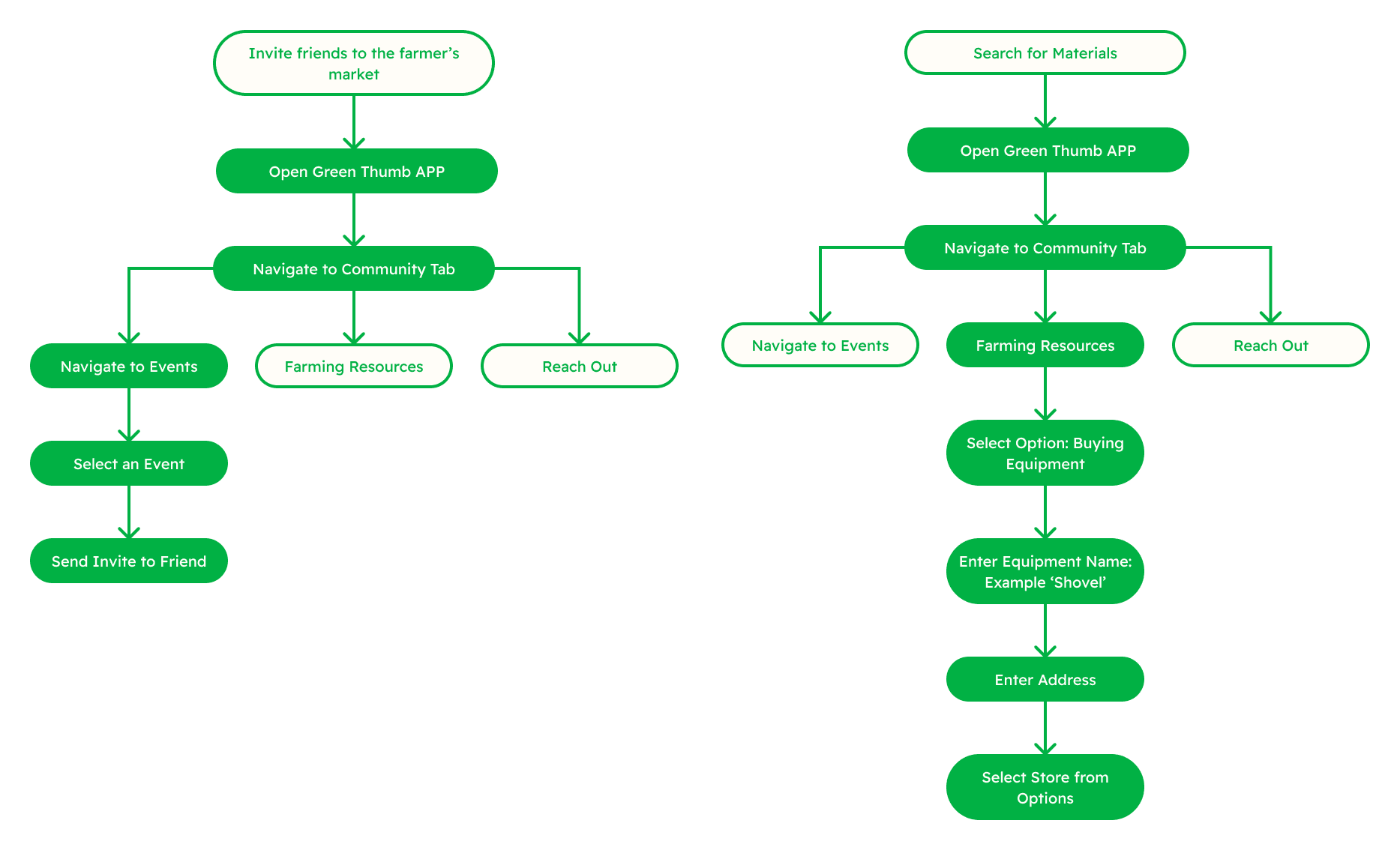
For the initial design phase, I focused on the 'community and resources' aspect. This part of the design was important as it showed that there is more to farming than the actual farming process itself.
I drew out hierarchical task analyses for key tasks that users would need to be able to achieve as part of the 'community + resources' features. This helped envision the layout and flow of the design, helping ensure that users would actually be able to get where they need to with steps that make sense.
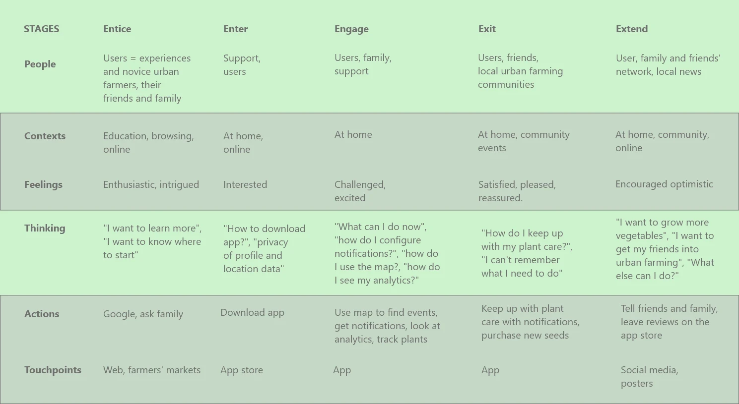
experience map.
For the initial design phase, I focused on the 'community and resources' aspect. This part of the design was important as it showed that there is more to farming than the actual farming process itself.
low fidelity prototypes.
We went old school for the low fidelity prototypes and sketched out our system design onto sheets of paper. This helped us focus on the actual design of the system without having to waste manpower and time on perfecting details that didn't matter at this point in the process.
cognitive walkthrough.
“Cognitive walkthroughs involve simulating a users problem-solving process at each step of the human-computer dialogue, checking to see if the user’s goals and memory for action can be used to lead to the next correct action.”
- Nielsen & Mack, 1994.
The cognitive walkthrough involved us collectively going through the steps of the design and attempt to perform key tasks that users would need to perform using the low-fidelity prototypes.
The walkthrough showed us how 'choppy' the design initially was, and helped show pieces missing (such as buttons and screens that led nowhere). It essentially helped us see issues that users would face pertaining to the general flow of the design. It allowed us to truly visualize whether the steps users would have to take to accomplish tasks made intuitive sense.
Nielsen's usability
heuristic evaluations.
We used Nielsen's usability heuristics to thoroughly analyze our design for any violations of the heuristics. These evaluations allowed us to scrutinize tiny details in the design. Although initially they all seemed like minuscule negligible design inconsistencies, when we looked at them all together, we could see the big difference they would make to the overall design and experience a user would have. These heuristics really allowed us to rip apart our design and build it back up with a much stronger and more intuitive interface.
Given that each member of the group conducted these evaluations individually, once collated together, we had much more confidence in heuristic violations that multiple members identified.
visibility of system status.
consistency & standards.
flexibility & efficiency of use.
help and documentation.
match between system & real world.
error prevention.
aesthetic and minimalist design.
user control & freedom.
recognition rather than recall.
help users with errors.
research & design.
We had to ensure that our design included solutions to the insights gained from the research phase of the project.
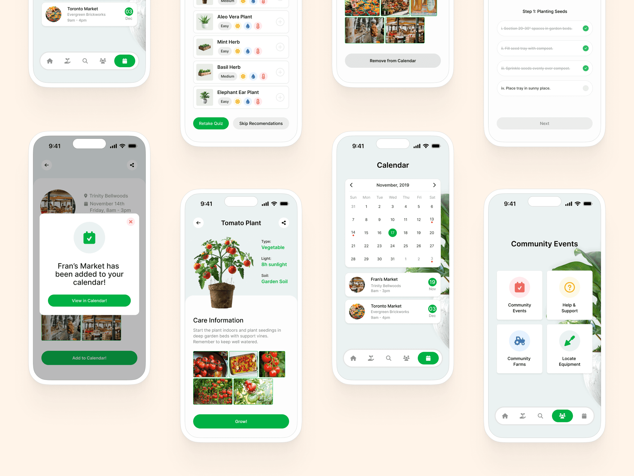
Buzzfeed Quizzes
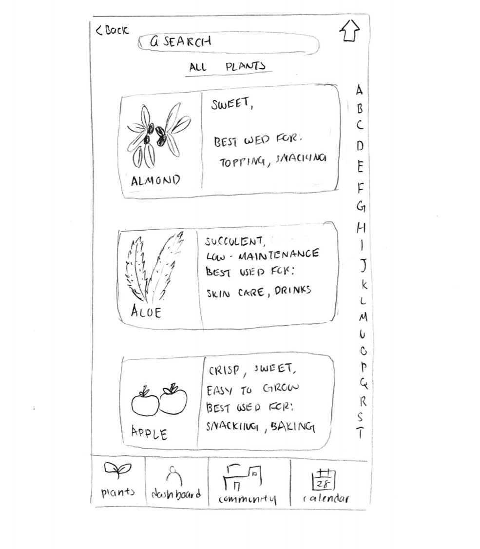
The cognitive walkthrough helped us realize that it would be quite difficult for a user to pick a plant to grow based on 4 criteria. Especially given the fact that users may want to pick a plant with characteristics that are not mutually exclusive.
So, by being partly inspired by amusing Buzzfeed quizzes, we implemented a recommendation system for choosing a plant to grow based on a short quiz. This would help users save time and allow for a more personalized experience.
One small step for man….
A very important feature of our interface involved step by step instructions to allow beginners to follow along. Each step was broken down into smaller steps as this would make the steps seem more feasible.
This was done in hope to encourage the user, and so increase the likeliness of the user to continue tracking their progress. This idea is based on a psychological principle of attitudes and behavior which explains that the best predictor for future behavior is pastsuccessful behavior (Albarracín & Wyer, 2000).
We also incorporated the idea of Positive Reinforcement by including a cute animation popping up every time a step is completed - again, to encourage users to complete more steps.
Add to Calendar
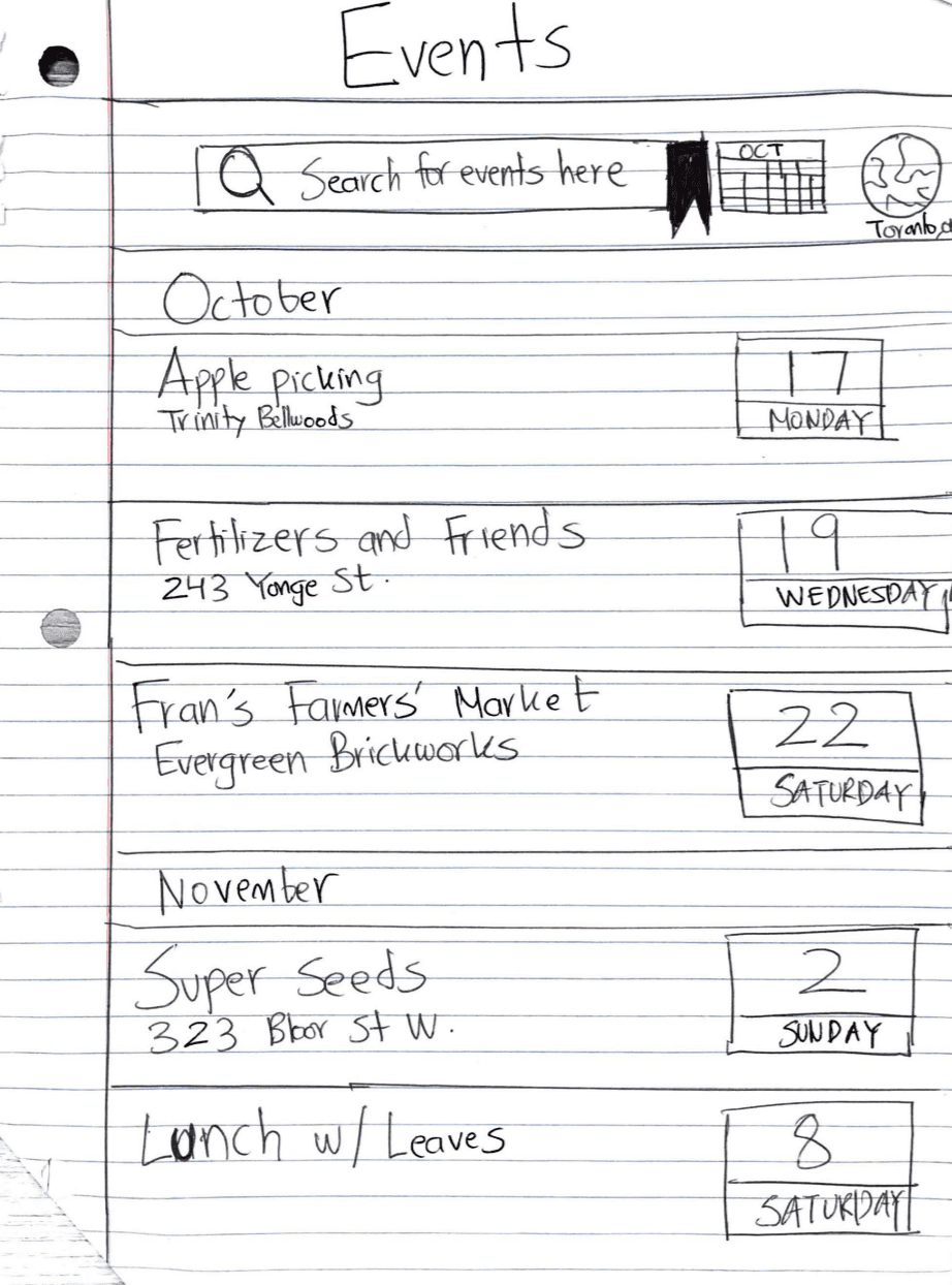
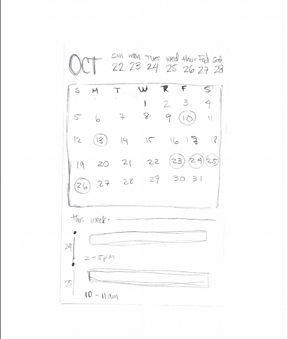
Users will be recommended events in their area, and will also have the ability to add events to their calendars.
reflection.
This was my first time working in a group setting and it helped me appreciate the different insights and perspectives offered by people from various backgrounds. It allowed us to discuss and iterate upon ideas until we could settle on a design that we were all happy with. My prior projects did not have the chance to be benefited from such collaboration. Working in such a collaborative setting also allowed me to enjoy the difficulties and tight deadlines because we were all in it together.